How User Interface (UI) Kits Develop Design Languages
When user interface (UI) designers set out to make a new design, having a central hub of assets makes it easier to get where they want to go. At its core, a design’s cohesive and uniform design system gives it a consistent look and feel that makes it easier for people to understand when it’s used in digital or print mediums. In a design system as a whole, UI kits are like an overarching language that tells other important parts of a design what to do.
What does a User Interface (UI) kit entail?
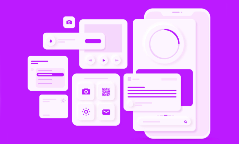
UI kits have all the parts and pieces that make up a digital design. For example, when you scroll through a website, you might see icons, interactive widgets, or buttons that let you send a request. All of these things can be found in a UI kit, which designers can use all over a website or mobile app’s interface.
When you look at how a UI kit is put together, it has two main parts: components and styles. Components are things like input fields, checkboxes, radio buttons, sliders, icons, micro-interactions, and more that a user can interact with and that communicate meaning and function.
Styles, on the other hand, are the parts of a design that you can see, like the color scheme, the fonts and typography, and even the shapes. Components and styles come together to make a UI kit, which is the main source for a brand’s visual identity.
Related: How to build a user-centric Healthcare App?
UI kits steady the design process
UI kit component libraries are sometimes used to put together UI components and elements, especially during the wireframe and prototyping stages of an interface design. In prototyping stages, such as wireframes, designers can pick and choose which parts to use. For example, if a UI designer is making the first step of a design, like a wireframe for a mobile app, they need an outline of the design before they can move on to the development stage.
With tools like Adobe XD, designers can choose from pre-made templates (like a log-in screen) and drop them right into their sketch, so they don’t have to make a new screen from scratch. This is not only convenient, but these templates are also very important for pushing a project forward, especially if it has a tight deadline. With these ready-to-use elements, UI kits make the design process more stable and save money on overhead costs.
Picking parts from UI kits, on the other hand, should be done carefully to make sure consistency, even if the project is still in its early stages.
When UI elements are the same, the tone of a project is the same, and it’s easy to update a project with a consistent style. A good design has carefully chosen parts, like a navigation menu that stays the same or interactive buttons that all have the same geometric shape, size, and color scheme.


Related: 5 Best Website Screenshot Software in 2022
UI kits and brand storytelling
UI kits are a great way to keep all of your digital design interface’s assets in one place. A company’s established UI kit is also very important for telling a brand’s visual story in a brand guide with a single, connected language. Brand guidelines explain the basic parts that make up a brand’s identity, such as the UI elements in UI kits, typography, logo size and spacing, color palettes, tone, and overall company characteristics.
Brand guideline manuals show all of the visual assets that are in a UI kit. These visual assets also need to show the brand’s tone, mission, and purpose. For instance, if a non-profit organization’s brand book had a serious tone, its UI assets from a UI kit shouldn’t be flashy or made of neon colors. Sticking to a consistent visual kit, on the other hand, might mean using neutral and light colors, as well as round, simple icons and components. So, when putting together a new UI from a kit, it’s important to make careful design choices that help tell a brand’s story.
Related: 11 Best Web Hosting Services for 2022
Streamline your design process
Putting together a UI kit is like putting together pieces of a puzzle to see the whole. To make a single design, each piece should fit together perfectly. When starting the first steps of a UI kit, it’s important to always think about the following:
Before putting the pieces together, it’s important to go through a conceptual phase to figure out what your design’s goal is, if it fits with a brand’s tone, and if there are any problems it could fix.
Once you know what the design is for, you can choose the theme of the UI kit. This makes it easier to choose or design the parts, and then the same language will be used to connect the parts that are the same. When putting together your design kit, it’s also important to make sure that all of the main building parts are covered.
From there, designers can choose the style of their components and change them to fit into the structure of their design. When putting together a UI kit for stakeholders, it’s also a good idea to give them different design directions and let them choose which one they like best to be tweaked and then finalized. UI kits are like a branch that grows out of a whole design system. They give designers, users, and everyone in between a visual language they can understand and enjoy.